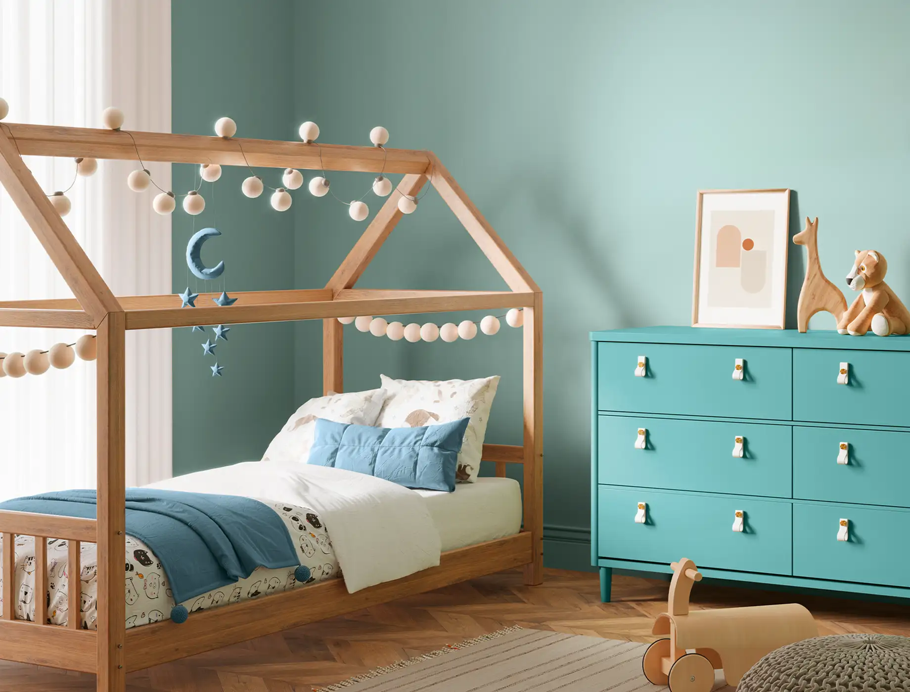
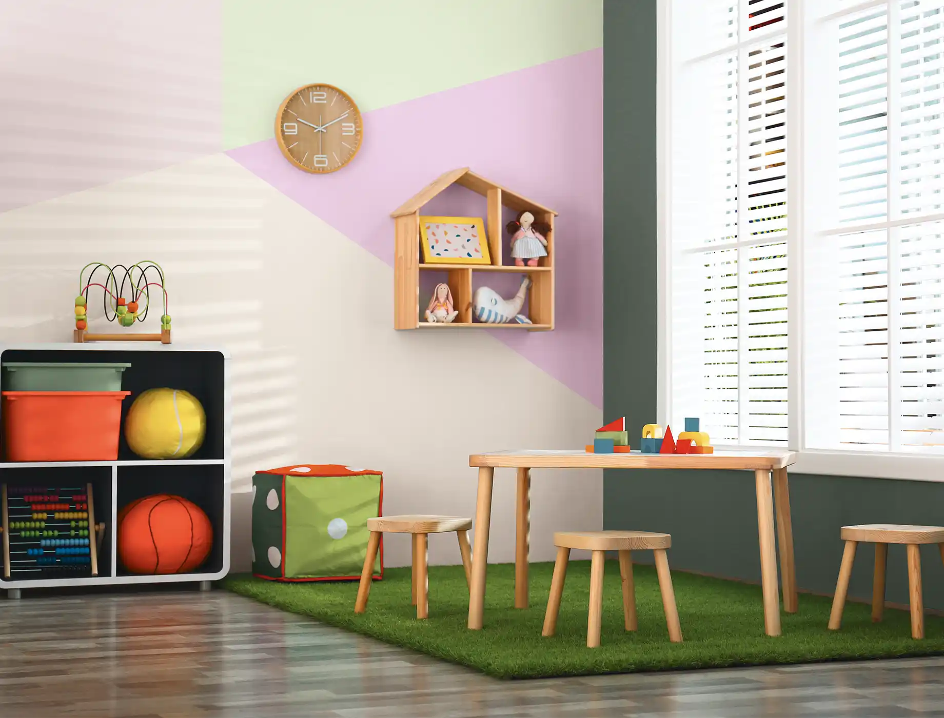
In Malaysia, where lush greenery and calm blue waters are part of everyday life, bringing blue and green tones into your home can reflect these natural surroundings. Blue creates a calming effect, while green adds a sense of peace, making them perfect for relaxing and inviting spaces. Blue-green shades, from soft pastel tones to bold teals, offer versatility and balance, making them suitable for a variety of moods and styles.
Incorporating Blue & Greens into Your Home
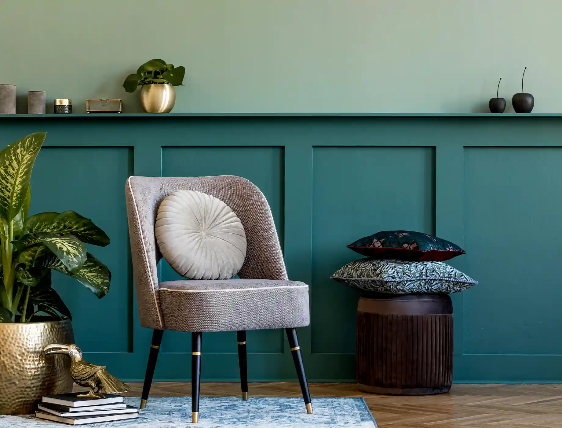
One of the charms of blue-green paint is how it changes with its undertones. Shades with green undertones feel warm and welcoming, while blue undertones create a cooler and more refreshing look. Light blue-green tones are great for brightening small, dim spaces like bedrooms or bathrooms, giving them a more open and airy feel. On the other hand, darker shades like rich teal add a cosy and sophisticated touch, ideal for bedrooms or home offices where comfort and focus are important.
1. Earthy hues of greens
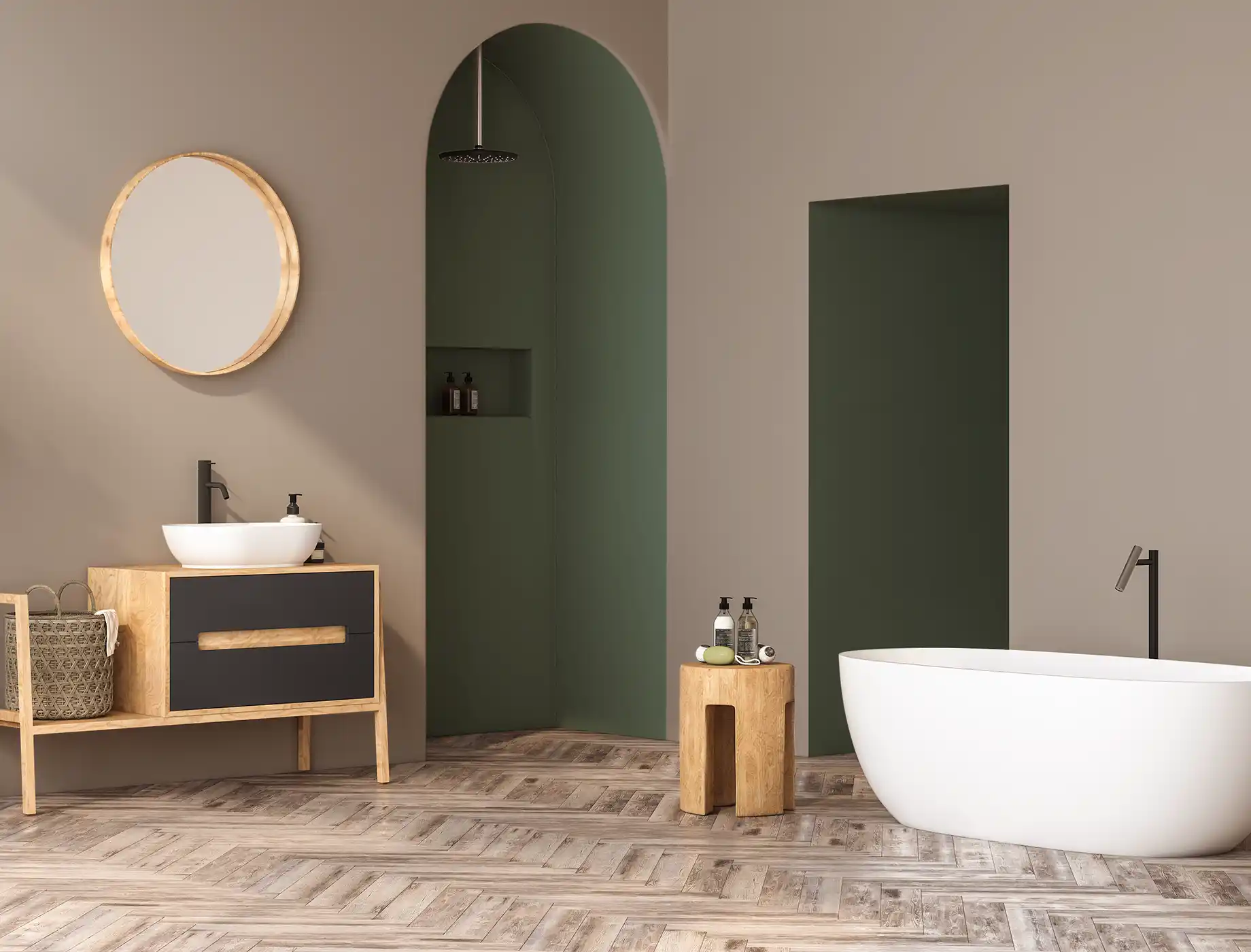
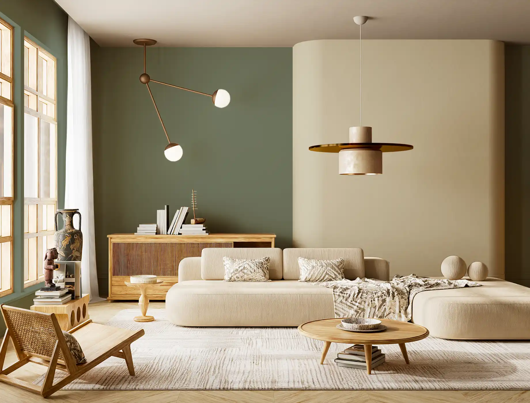
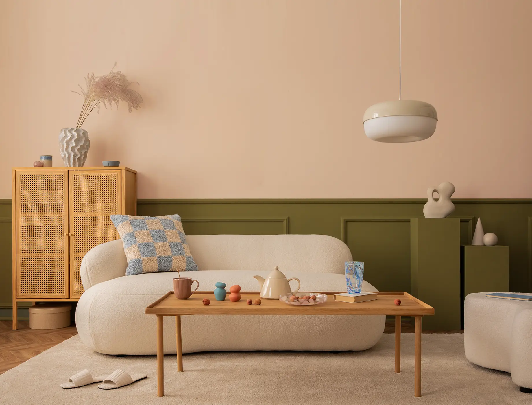
Rooted in nature yet designed for modern living, this palette blends grounded greens with comforting warmth. Tree House brings depth and grounding with its rich, forest-toned green, creating a cocooning atmosphere ideal for living rooms or statement walls. Fern Fusion is a softer, fresher shade with a subtle vibrancy that adds lightness and energy to your space.
Woven Straw serves as the warm neutral anchor, a muted beige with natural undertones. It tempers the greens, keeping the overall palette balanced, cohesive, and inviting. Style the palettes with walnut or oak furniture, matte black accents, linen upholstery, and indoor plants to achieve a modern organic aesthetic that feels curated, harmonious, and effortlessly lived-in.
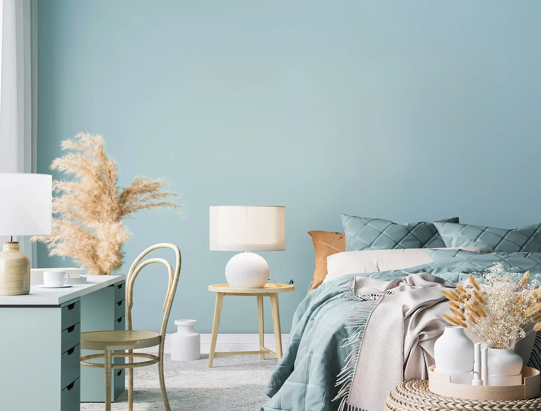
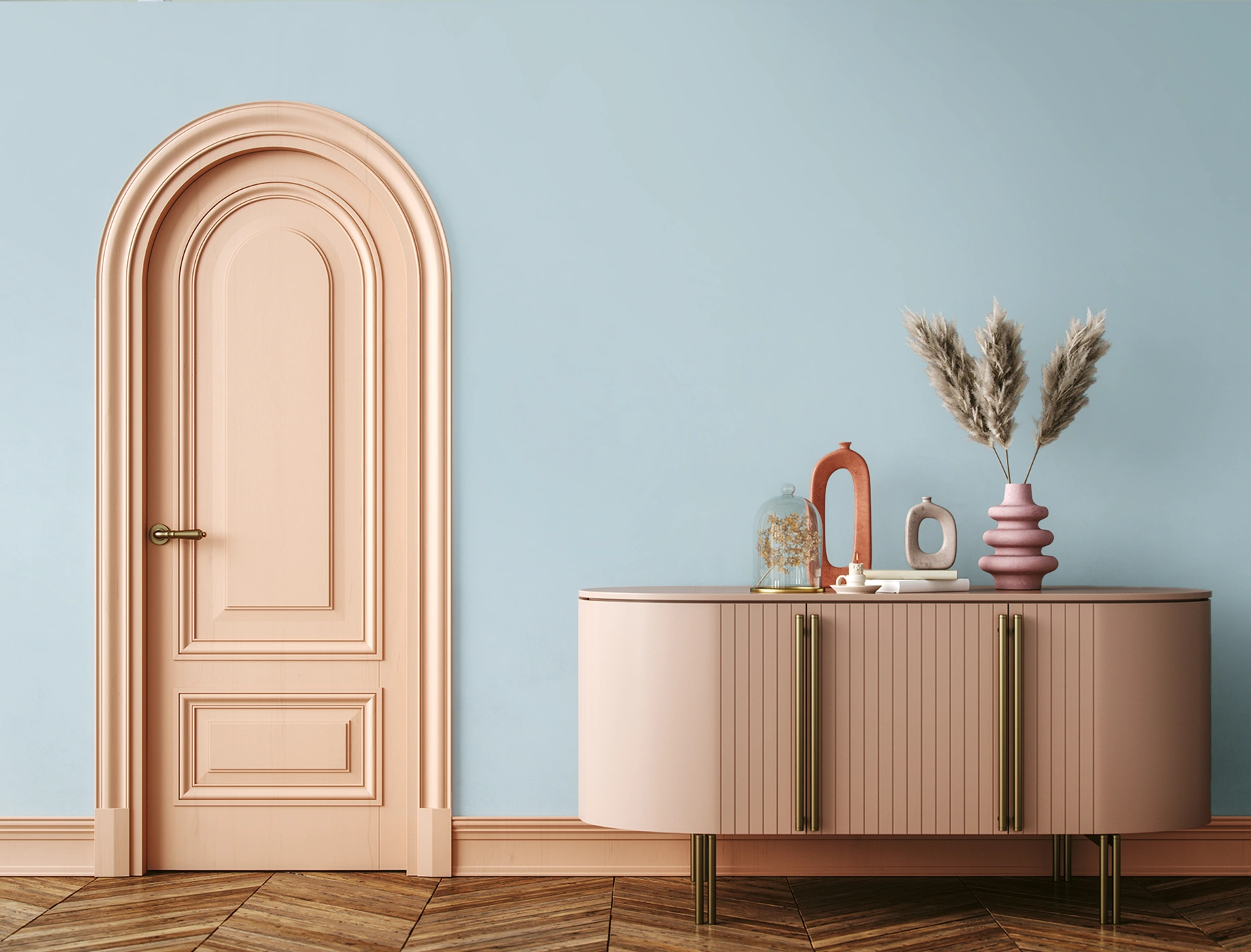
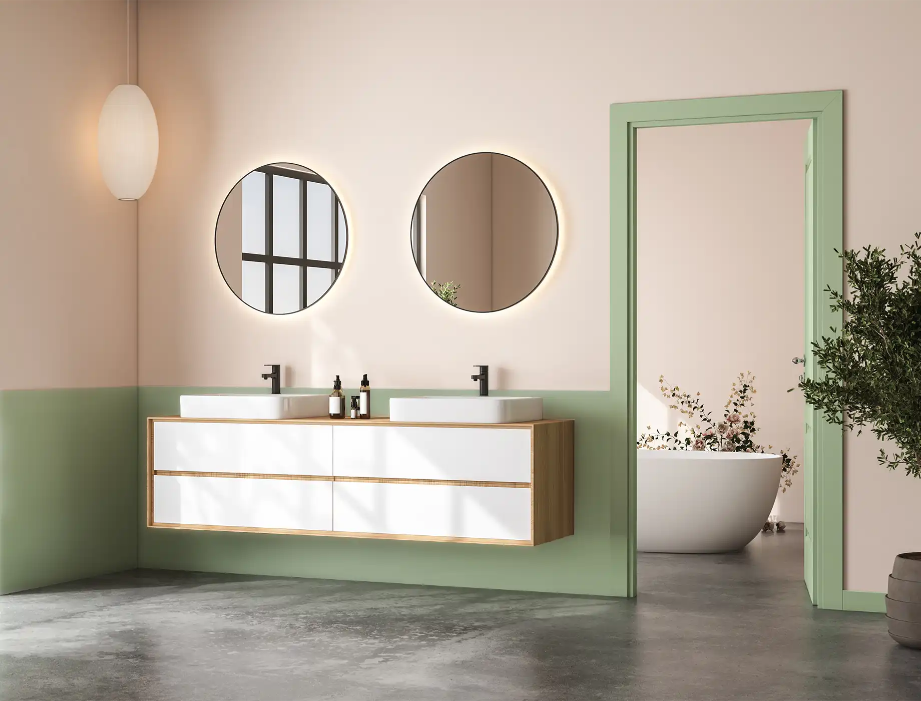
Opting for pale blue paint is an easy way to brighten your home while creating a calm and soothing atmosphere. Its muted tone exudes relaxation, bringing a refreshing touch that uplifts your space without overwhelming the senses. Many Malaysians gravitate towards soft, neutral hues like pale blue, as they create a harmonious ambiance suited for both modern and traditional interiors. These colours are perfect for achieving cosy, elegant spaces with a sense of openness.
To enhance the natural feel, pair pale blue with wooden furniture and greenery. This combination evokes a nature-inspired design that is both calming and inviting, making it a timeless choice for any room.
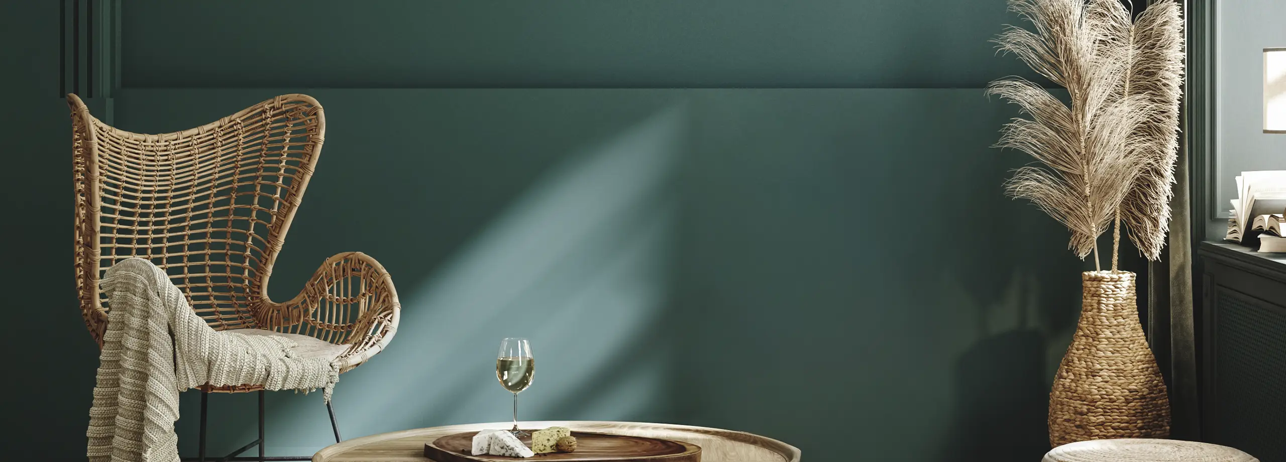
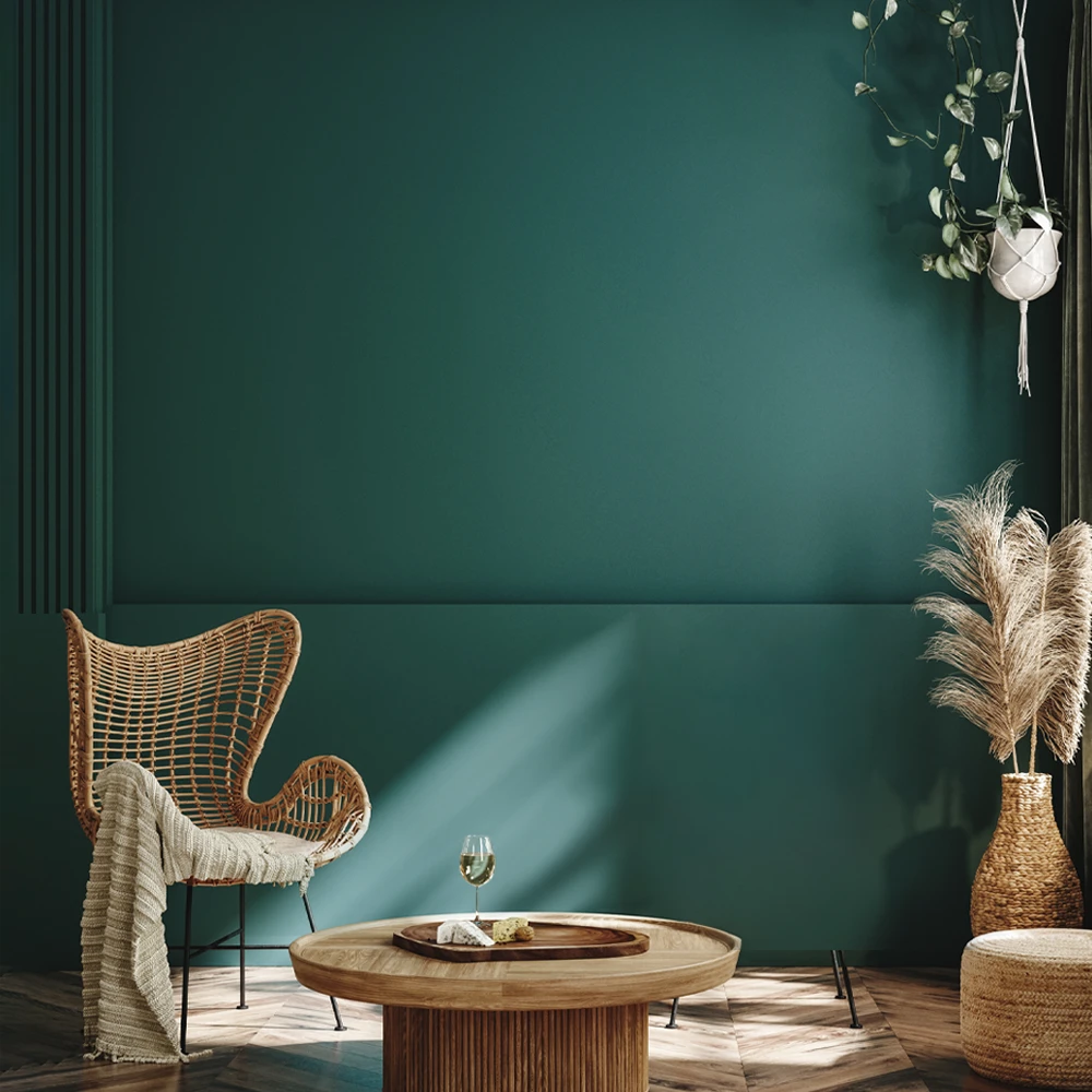
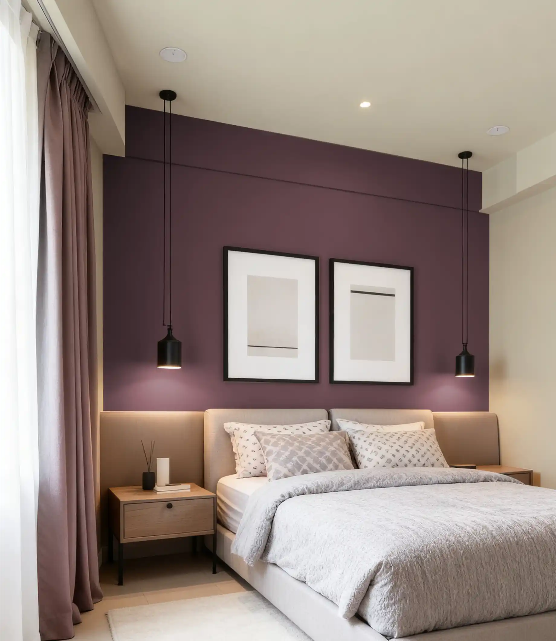
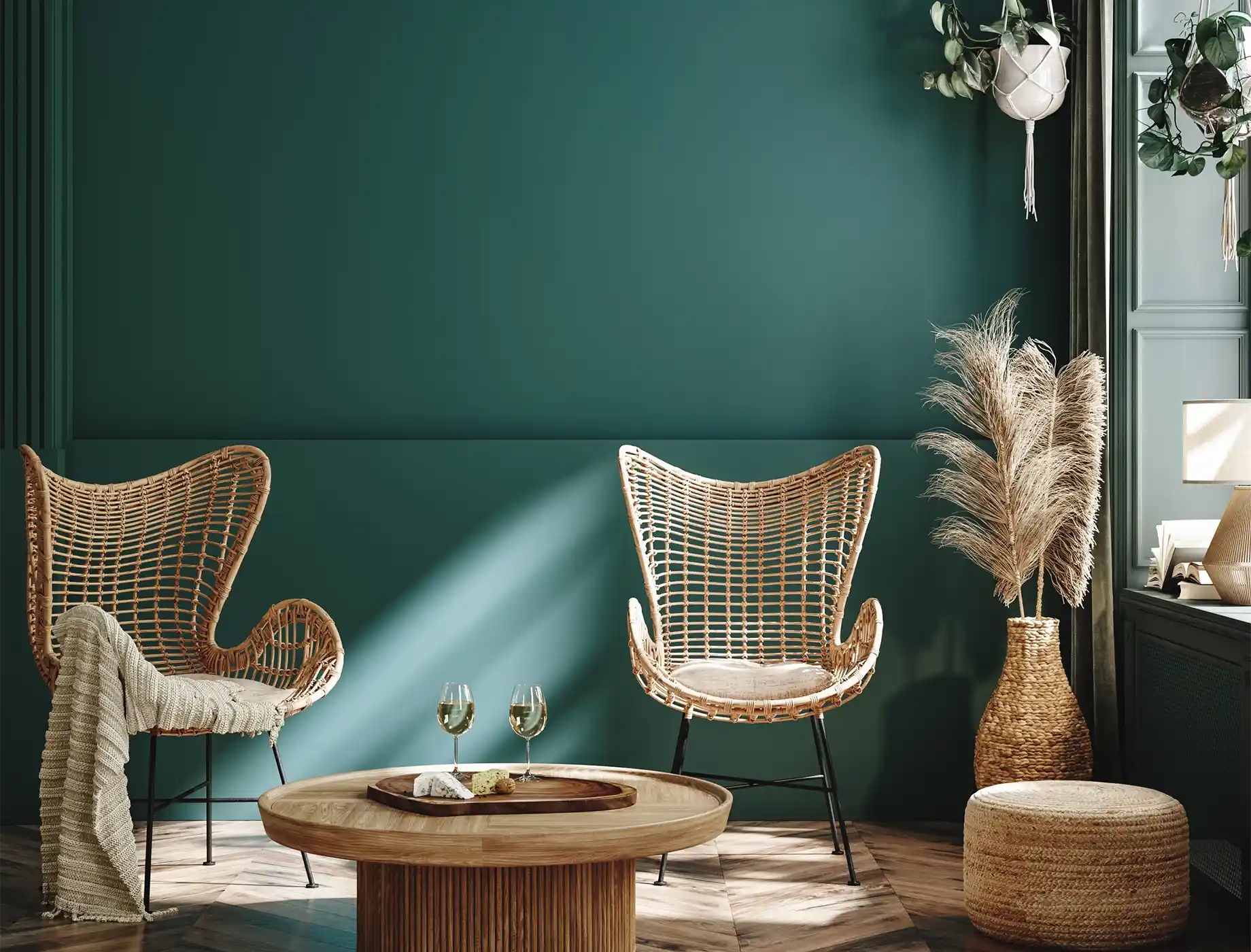
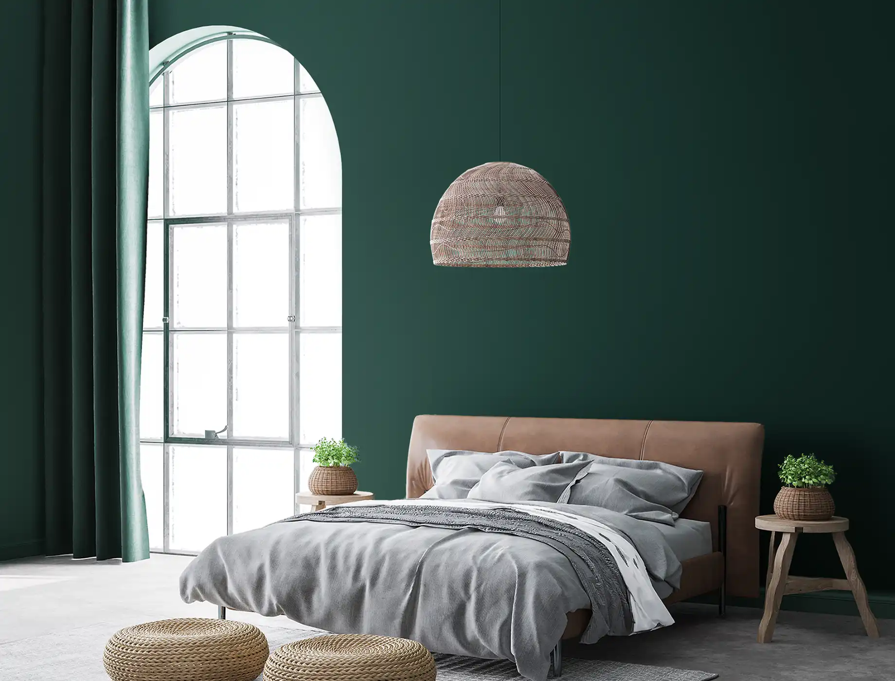
For those who desire a more luxurious, contemporary look, dark teal is a perfect choice. This rich, cool-toned shade blends blue and green undertones to create a sophisticated and moody ambience. Dark teal works wonderfully in spaces where you want to evoke a sense of depth and intimacy, such as a bedroom or home office.
To balance out the cool tone, incorporate contrasting colours like orange or yellow as accents. Pair dark teal with dark countertops, light wood, floral wallpaper, and brass fixtures to create a stylish and elegant environment that feels both modern and inviting.
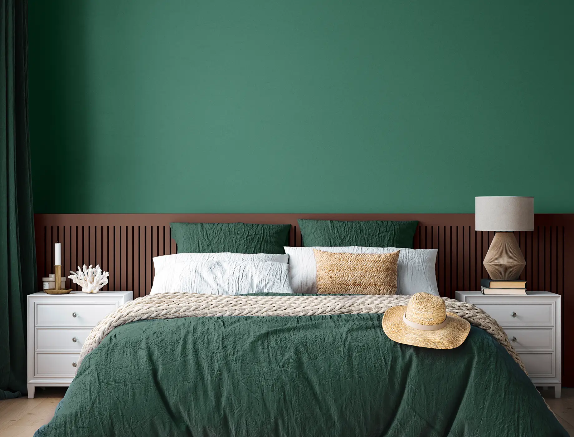
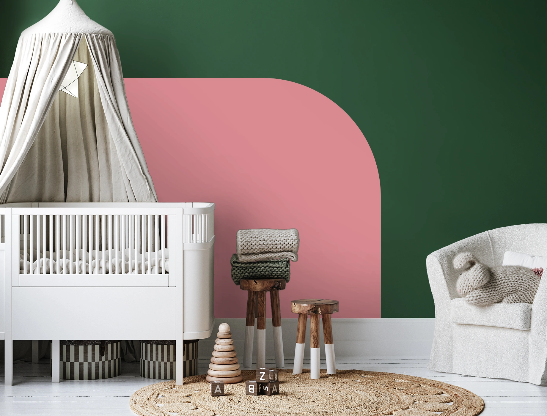
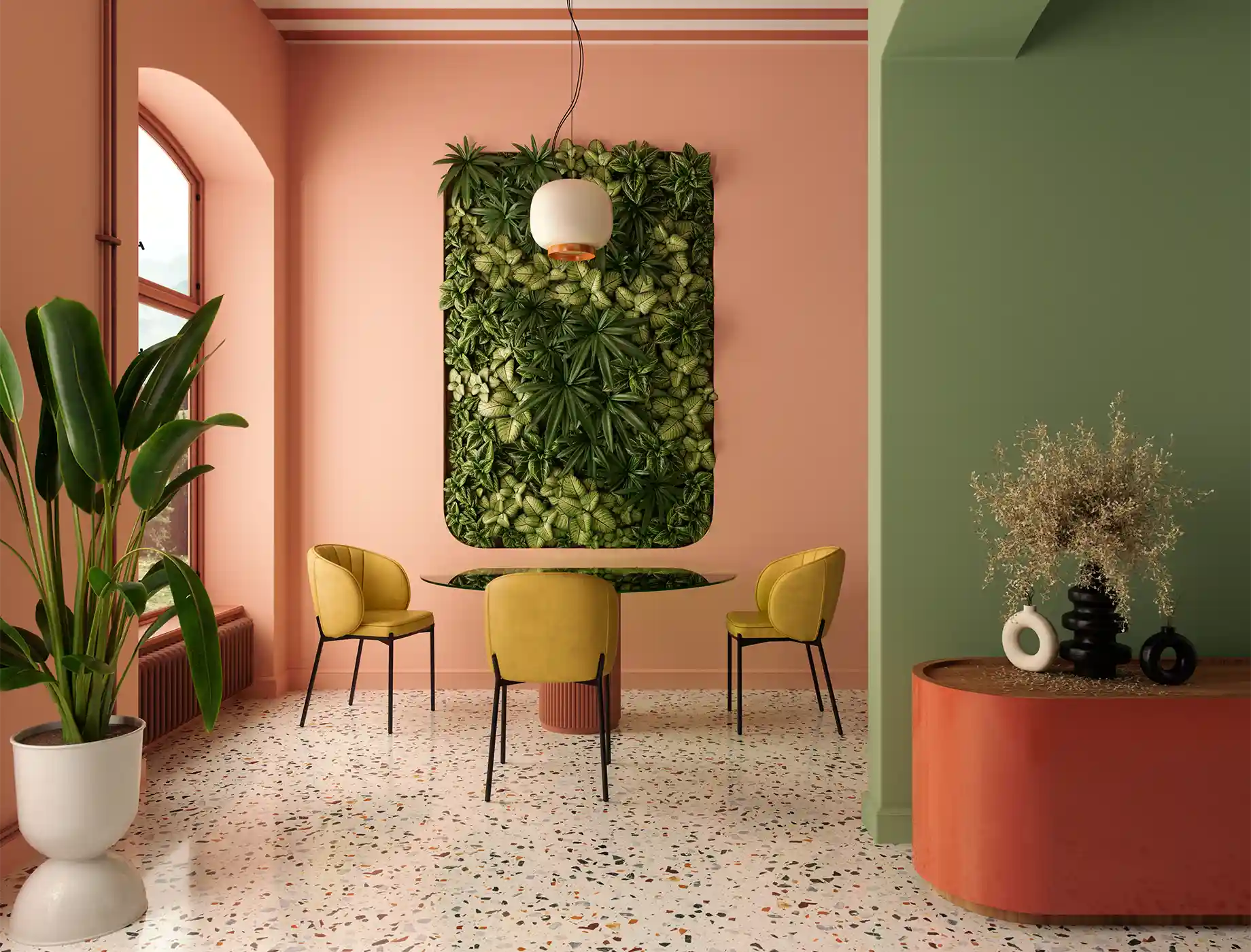
The combination of dark green and soft pink is a vibrant yet stylish pairing that can energise any space, from the living room to the bedroom, study, or kitchen. This contrast brings a lively and welcoming feel, striking the perfect balance between warmth and vibrancy for a modern yet cosy look. In Malaysian homes, green and pink can be used to create various styles, from relaxed glamour to fresh, bold interiors. Complete the look with gold lamps or fixtures to add a touch of luxury and elevate the overall aesthetic.
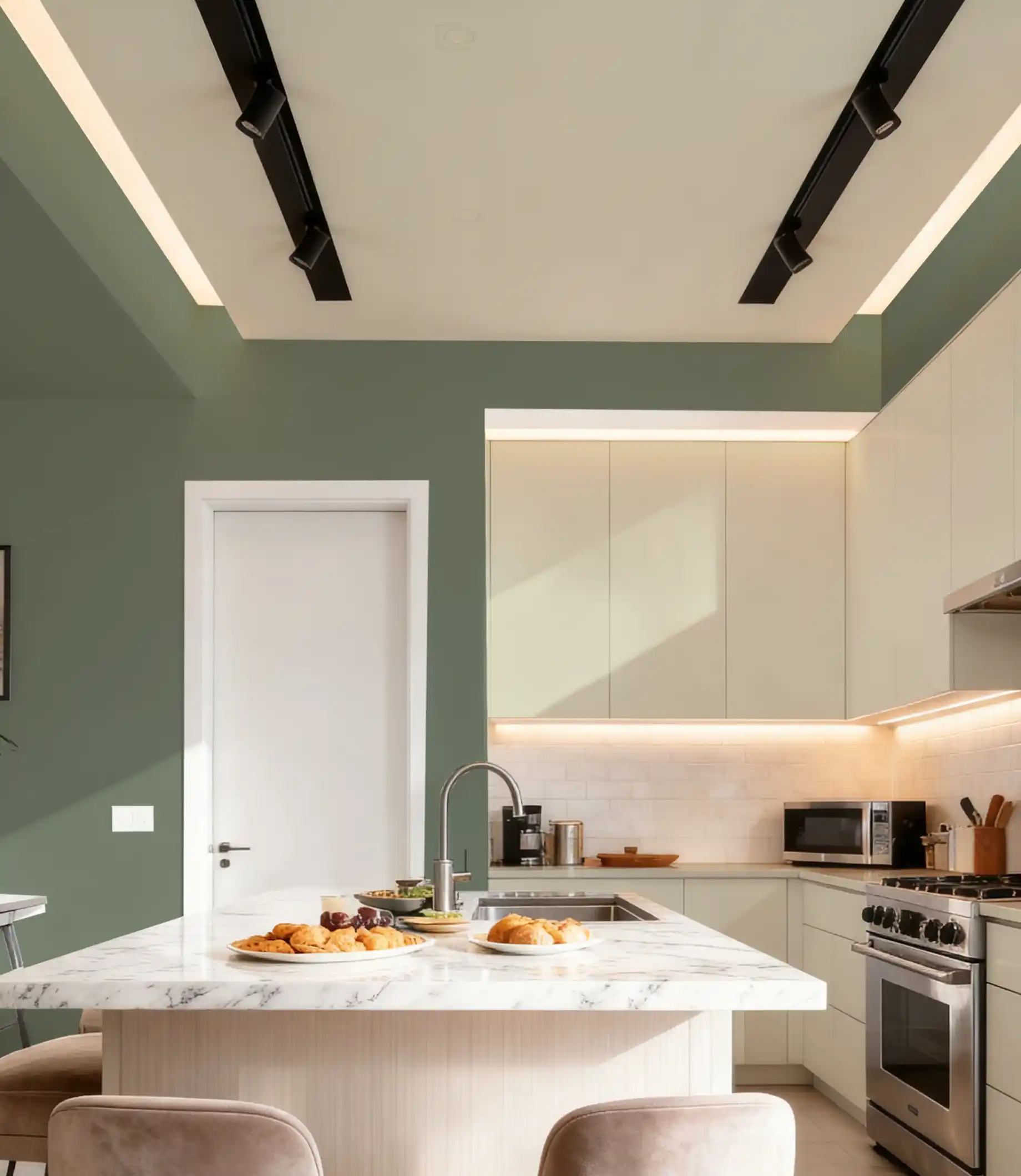
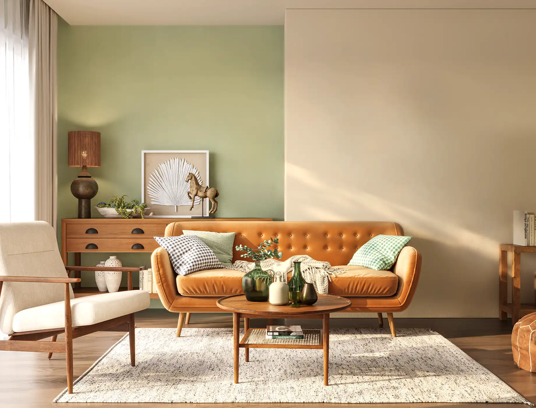
Sage green is a wonderful choice for creating a soothing and calming atmosphere in your home. This gentle, muted shade demonstrates serenity, making it perfect for spaces designed for rest and relaxation, such as bedrooms and living rooms. When paired with neutral tones like cream, white, and tan, sage green enhances the feeling of tranquillity while maintaining an elegant and serene aesthetic. To add warmth and texture, incorporate natural wood elements, creating a comforting and elegant space that invites relaxation.
Soft pale blues and deep dark teals can effortlessly transform your space into a calming retreat. For a healthier and long-lasting finish, paints like Nippon Paint’s Spot-Less Plus Sheen and Spot-Less Plus Matt are a great choice. Their low VOC (volatile organic compounds) formulation helps maintain better indoor air quality, creating a safer and more comfortable living environment while delivering a durable, beautiful finish.
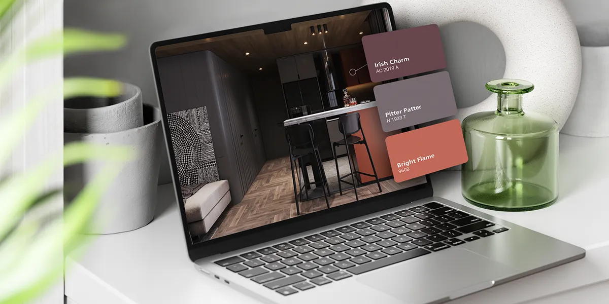
See a colour you like in real life?
Snap, upload, and Colour Match! Take a picture and upload it to our Colour Match tool to identify the closest Nippon Paint colour that it matches.