
costume green
NP AC 2120A
smooth as silk
NP OW 2152P
japanese curry
NP
tempest sea
NP AC 2107A
artist's impression
NP N 1864T
Berry Scent
NP

great seascape
NP 7106
lavender haze
NP 3023
Berry Scent
NP
fertile earth
NP AC 2145A
wet moccasin
NP
wet moccasin
NP R 1385T

brown bailey
NP AC 2141A
abacadabra
NP 7034
mocha magic
NP

terra peach
NP YO 1229P
affogato
NP AC 2134A
nude shades
NP

hazelnut haze
NP 1870
dandelion desire
NP 1003
fired stone
NP AC 3441A

florist yellow
NP AC 2052A
cactus cooler
NP 0444
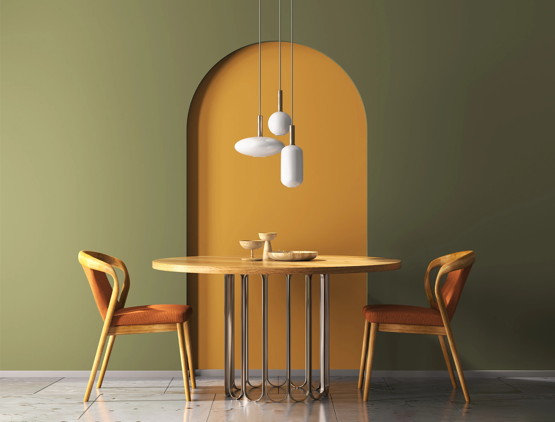
olive overture
NP 1854
celery seed
NP BGG 1731
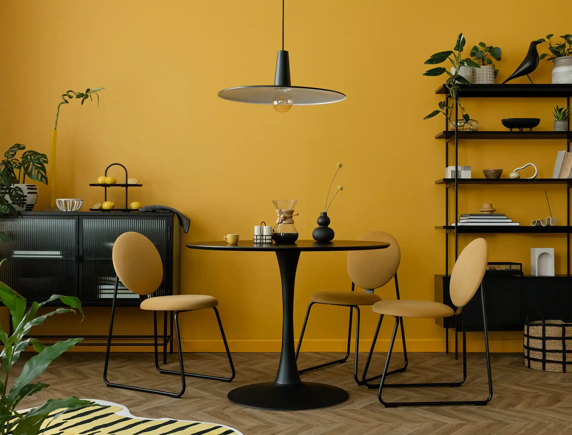
deep safron
NP AC 2051A
tigerstripe
NP YO 1232A
yellow blaze
NP AC 2053A
black
NP
silver flare
NP

magnolia blossom
NP R 1263P
orange kisses
NP AC 2060A
Berry Scent
NP

rhapsody
NP AC 2094A
laid back
NP OW 1056P
Berry Scent
NP
fluid blue
NP AC 2101A
oak parquet
NP N 1870D
Berry Scent
NP

blue mercury
NP AC 2099A
natural cedar
NP N 1878T
newtowne brown
NP N 1890A

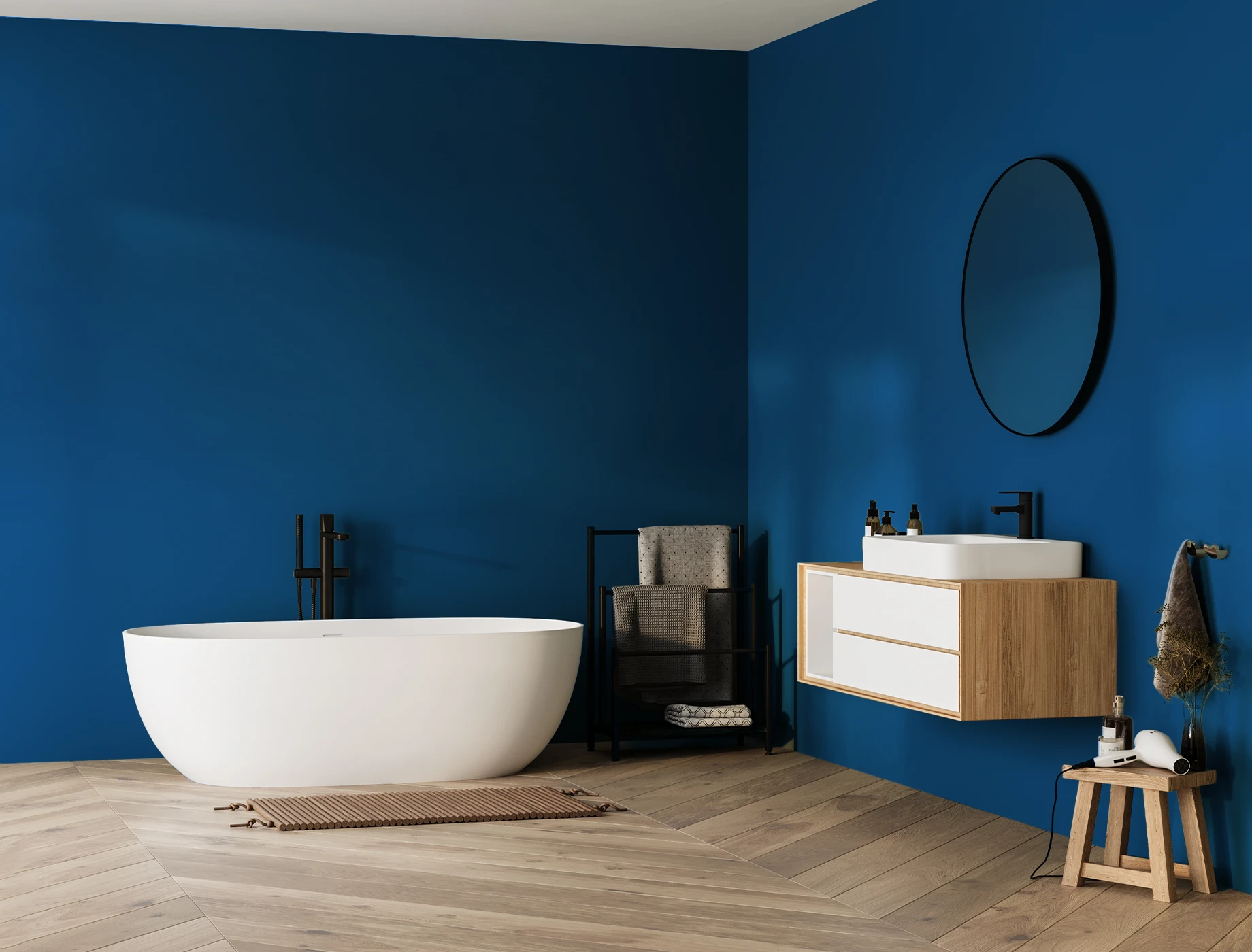
colbalt blue
NP AC 2100A
burgundy
NP R 1351A
Berry Scent
NP