tree house
NP 8266
woven straw
NP 8242
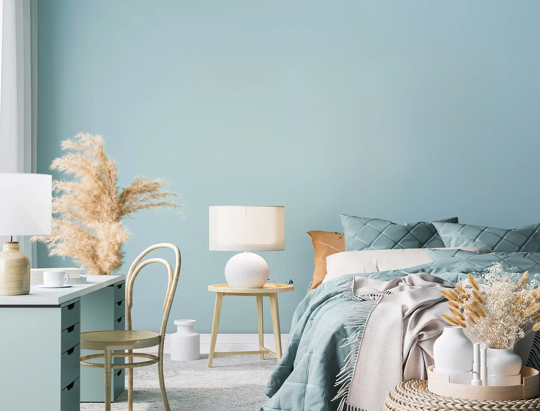
turquoise reflection
NP
soprano
NP AC 2142A
woven straw
NP 8242
caramel sugar
NP
natural stone
NP 8174
tree house
NP 8266
turquoise reflection
NP
tree house
NP 8266
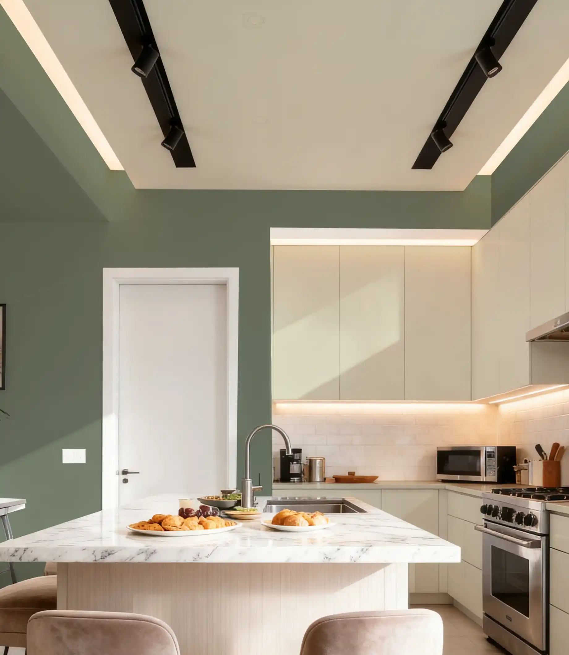
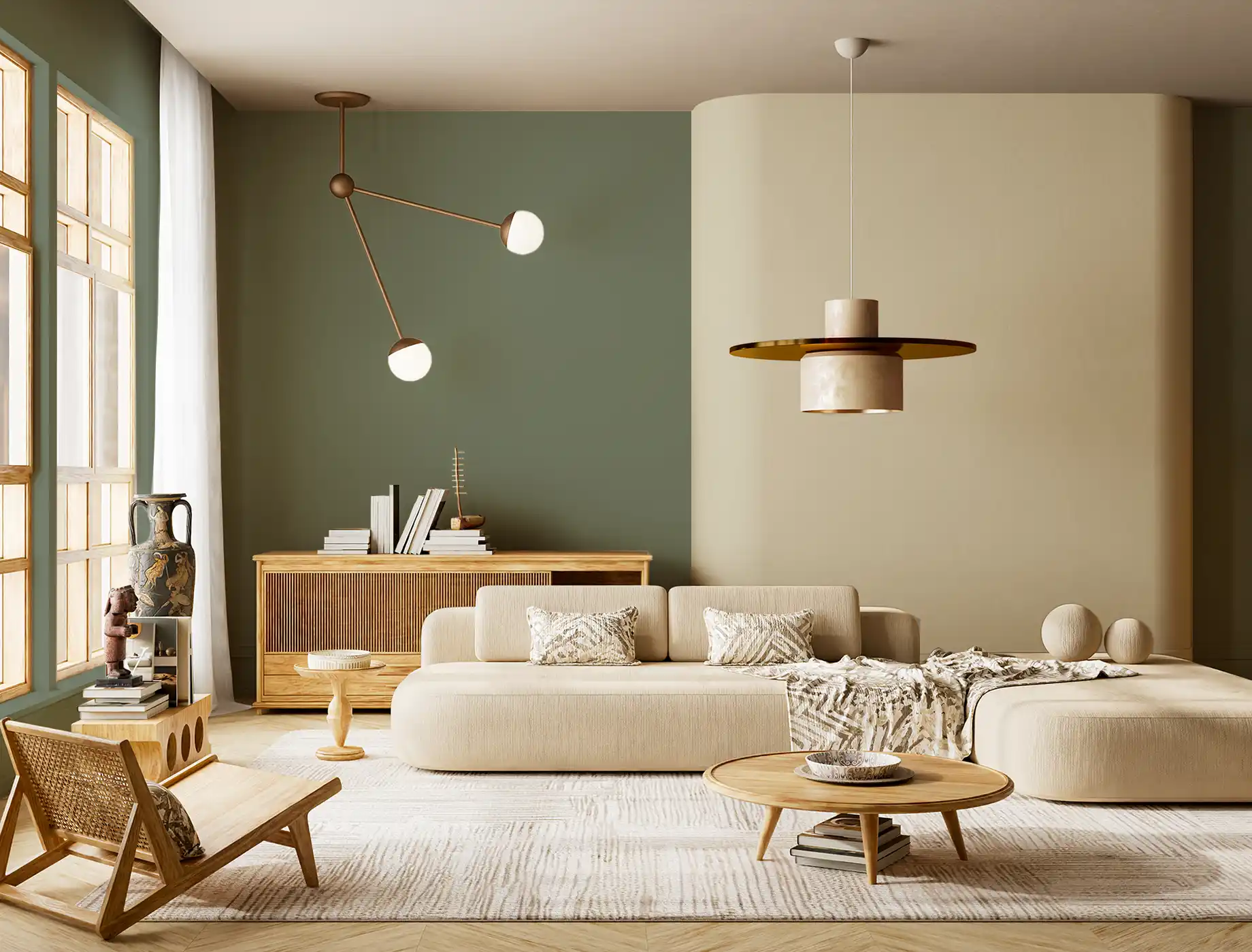
fern fusion
NP 1819
woven straw
NP 8242
blue wool
NP BGG 1572
sapling
NP N 1847T
caramel sugar
NP YO 1245T
glazed ceramic
NP BGG 2720
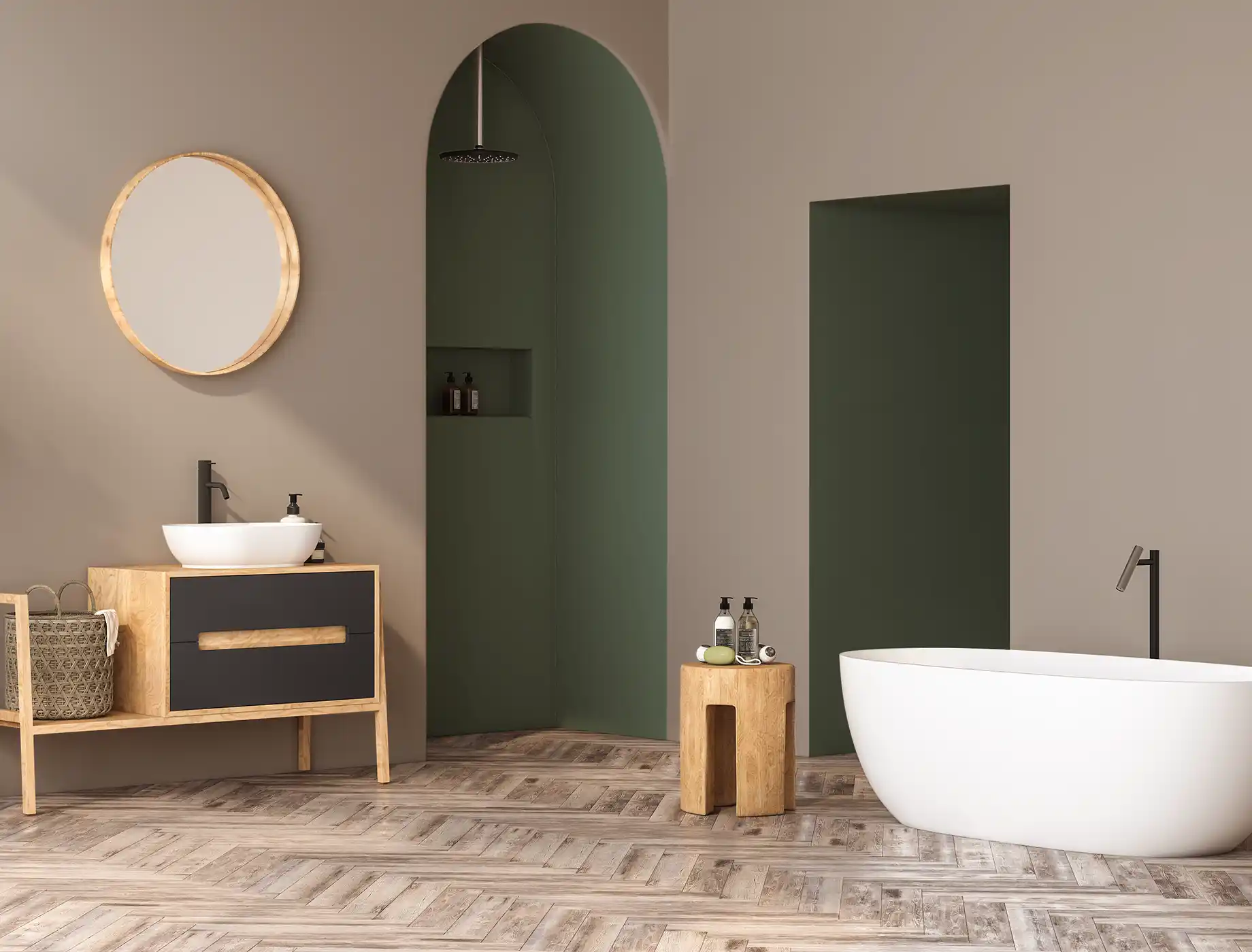
peninsular
NP N 3296D
turquoise reflection
NP BGG 2742
smooth sailing
NP BGG 1565
timber grain
NP R 1383P
caramel sugar
NP
slate crest
NP BGG 1807
red earth
NP R 1379A
natural oak
NP
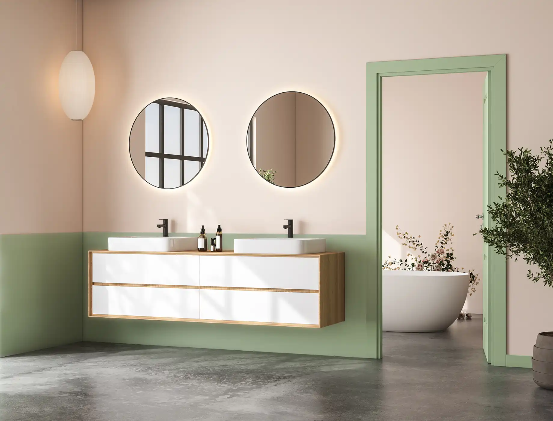
courtyard green
NP BGG 1806
Toasted Almond
NP
natural oak
NP N 1871T
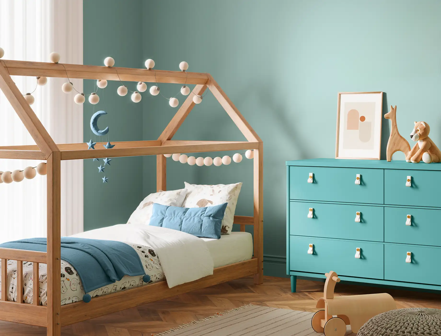
green gable
NP BGG 1813
sweet escapade
NP BGG 1759
suede shoes
NP N 1958P
diving pool
NP BGG 2769
wet moccasin
NP R 1385T
braintree road
NP N 1920T
angelic pink
NP OW 1029P
green montage
NP BGG 1752
Berry Scent
NP
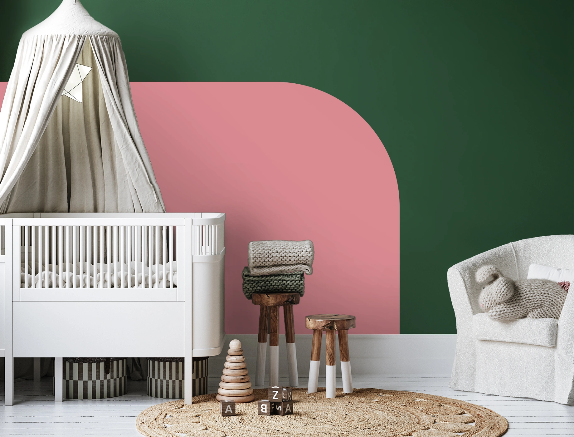
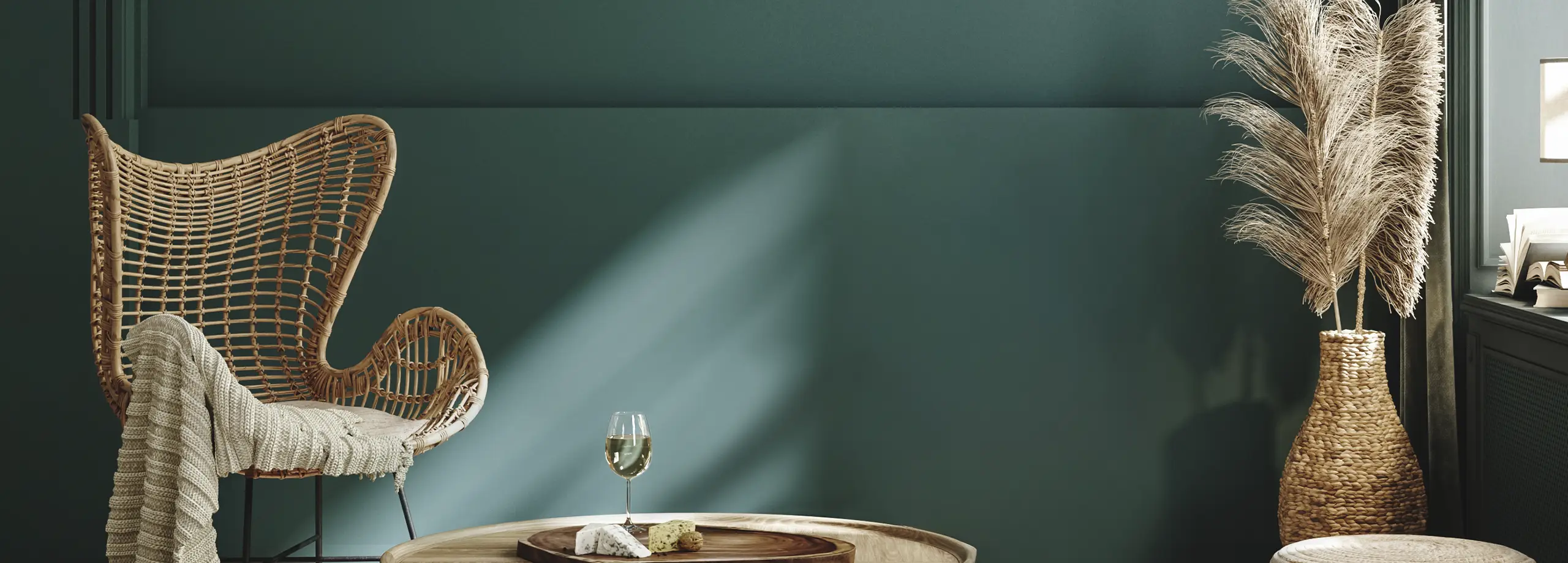
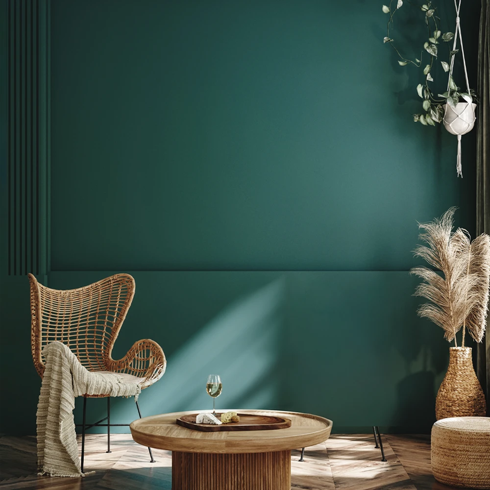
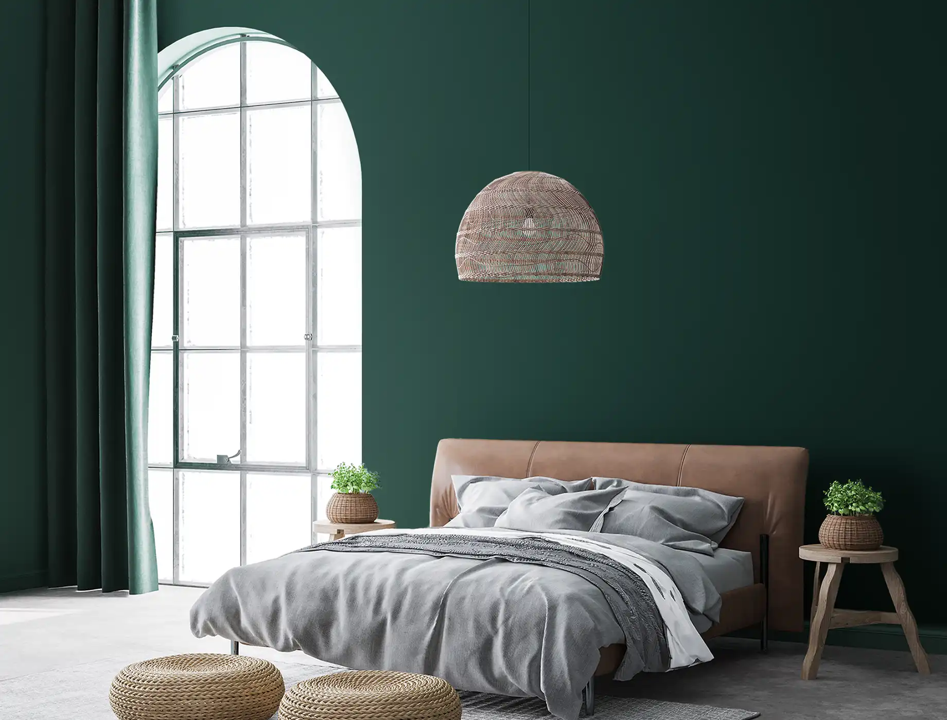
green abyss
NP BGG 1799
spring song
NP
hill cherry
NP 6346
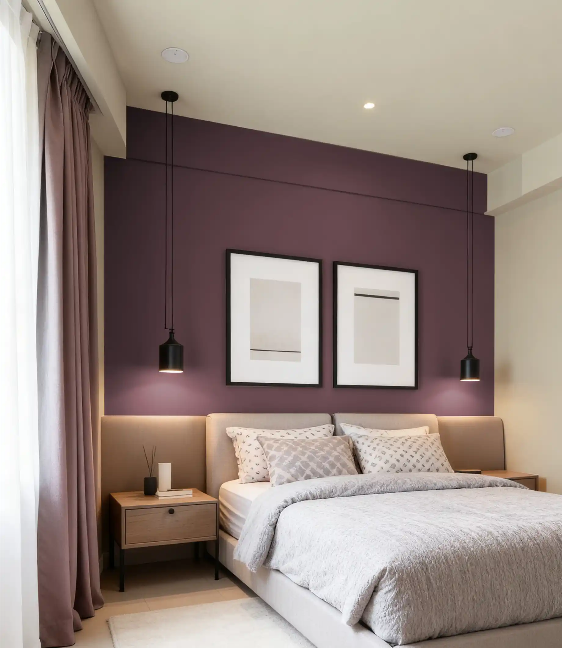
mauve dignity
NP PB 2983P
night dress
NP PB 1396P
cool wonder
NP BGG 2630
clay brushed
NP R 1368P
brazen
NP BGG 1751
cotillion red
NP AC 2071A
green living
NP BGG 1742
old barn
NP 6713
exciting orange
NP AC 2068A
woodward
NP BGG 1715
basket beige
NP N 1879P
corner cupboard
NP PB 1522P