mocha lover
NP N 3183D
dark brunette
NP N 3198A
Berry Scent
NP
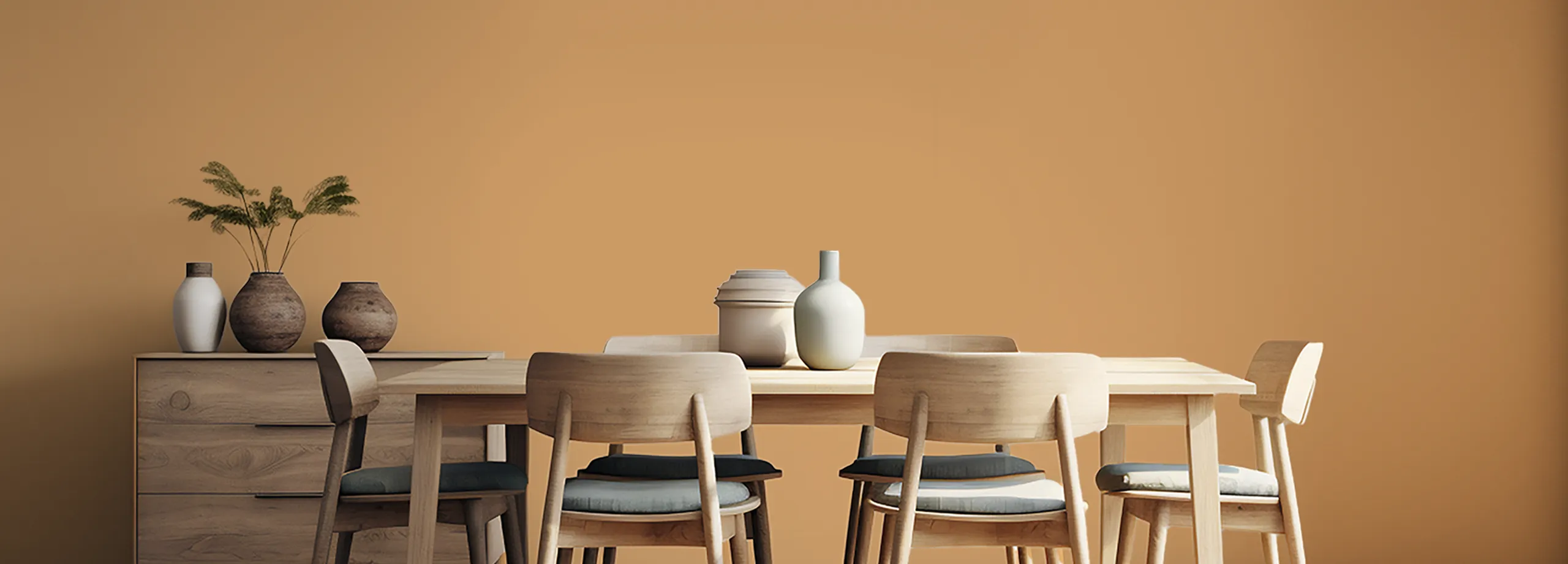
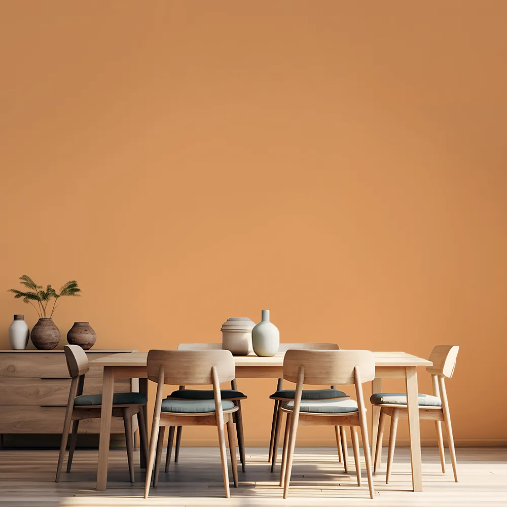
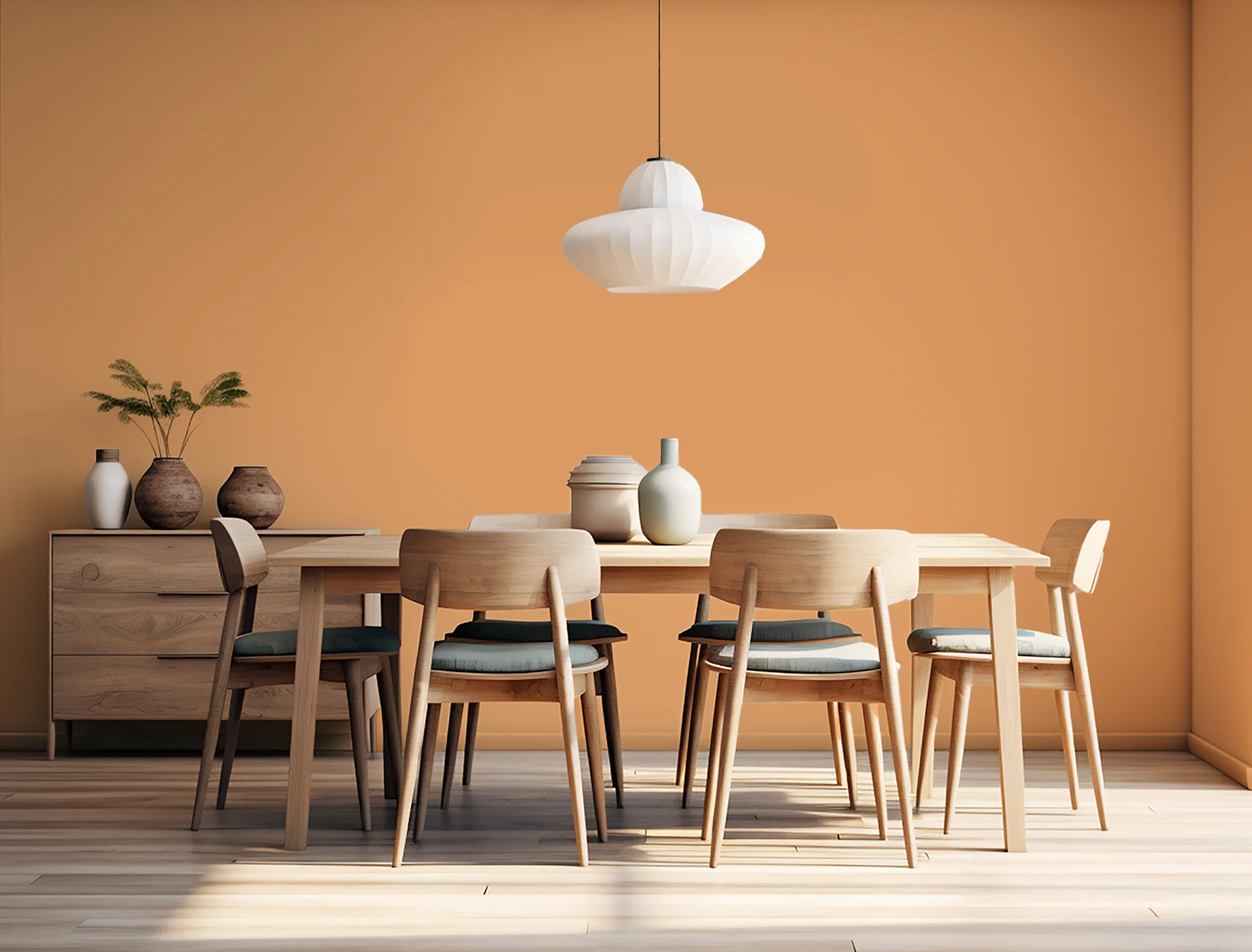
harvest orange
NP YO 1246A
sunstraw
NP YO 1255P
Berry Scent
NP
caramel sugar
NP YO 1245T
espresso bean
NP
lake stone
NP N 2000P
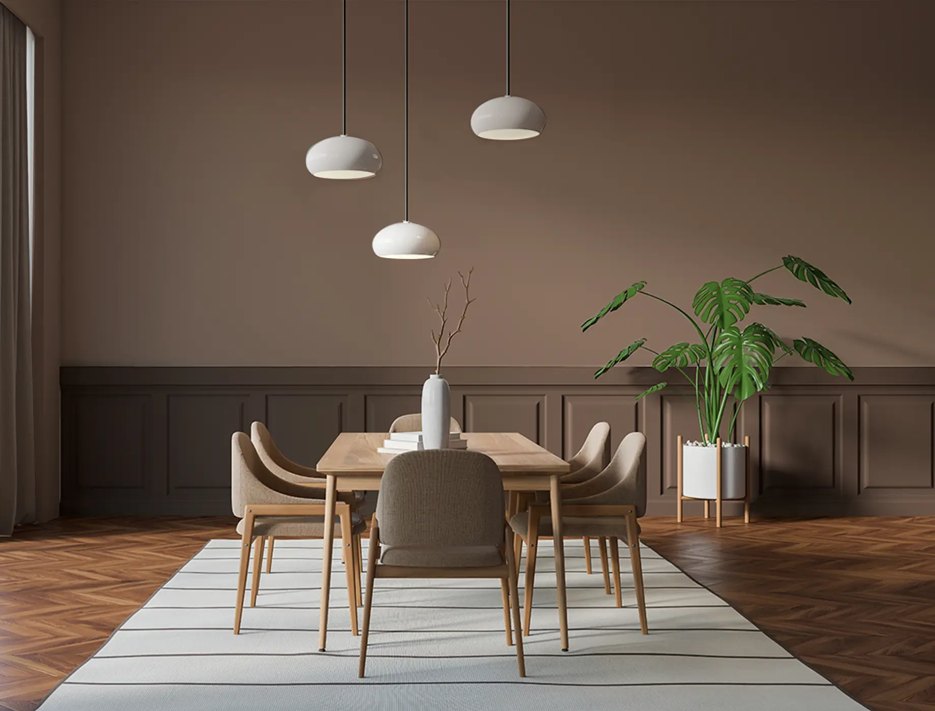
roxbury brown
NP N 1891D
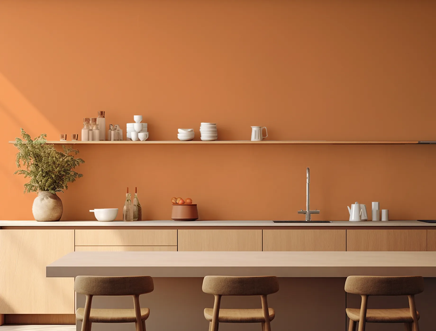
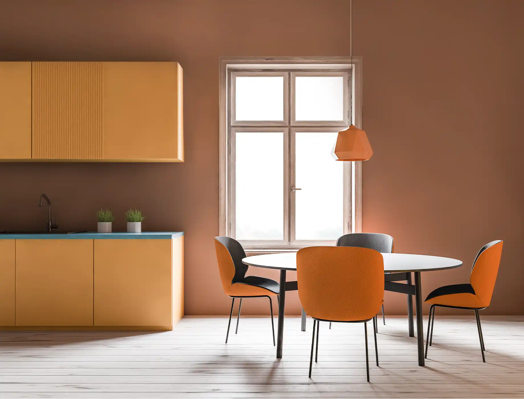
mansion gold
NP YO 1254D
tigerstripe
NP YO 1232A
silk ribbon
NP 7249
blue flippers
NP PB 1541D
Berry Scent
NP
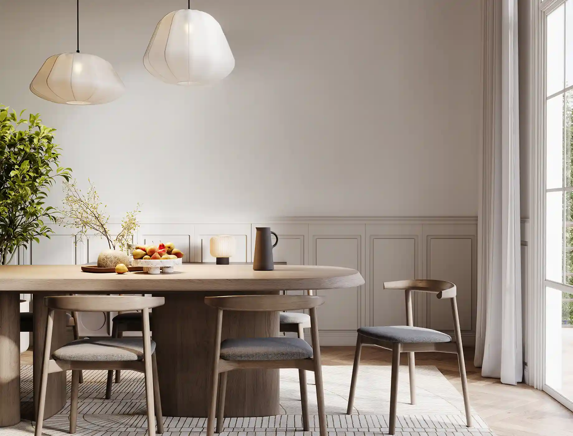
reticent white
NP OW 1083P
beige gray
NP N 1914P
artist's impression
NP N 1864T
delicate peach
NP YO 1243P
gray dew
NP OW 1086P
Berry Scent
NP

gray suit
NP N 2027P
concrete kerb
NP N 1833D
gray dots
NP N 2038D
battlestone
NP N 1915P
orange originality
NP AC 2057A
Berry Scent
NP
berry scent
NP OW 2189P
jam break
NP AC 2088A
Berry Scent
NP
mobe pearl
NP OW 1008P
natural oak
NP N 1871T
Berry Scent
NP
remembrance
NP OW 1053P
wall arte
NP N 1865P
Berry Scent
NP
white dawn
NP OW 1036P
shitake
NP N 1873P
Berry Scent
NP
parrot green
NP BGG 1756
pastry puff
NP 6843
sapling
NP N 1847T
silver skates
NP N 1999P
astrologers night
NP N 3303A
natural cedar
NP N 1878T
astrologers night
NP N 3303A
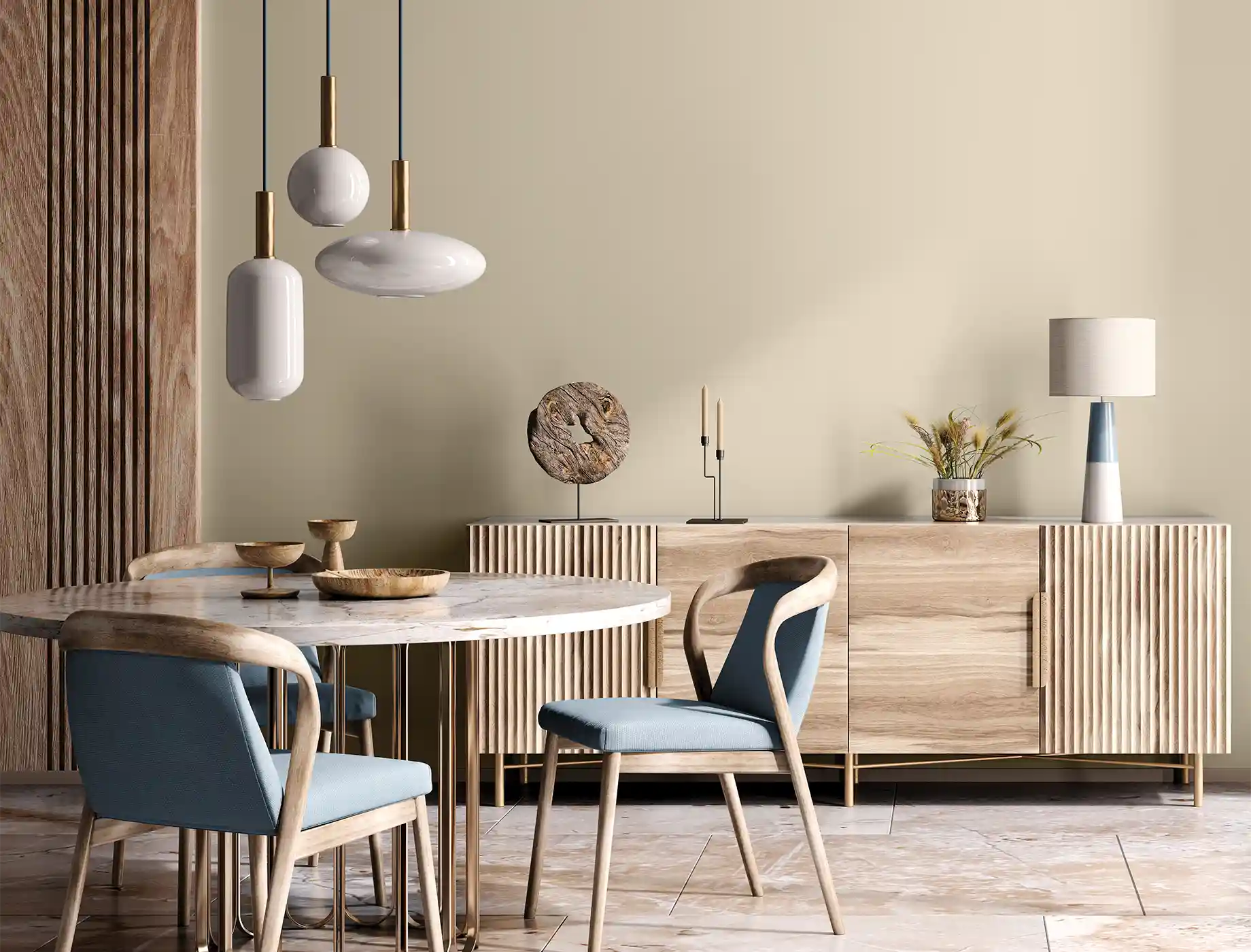
fortune cookie
NP
sapling
NP N 1847T